Inklusiv
Inklusiv is a location-based mobile app for tattoo seekers to find safe, inclusive shops and artists.
Women, people of color, and members of the LGBTQIA+ community consistently experience violence in the white, cis-male dominated tattoo industry. I wanted to explore designing an app that would help folks ensure that they only connect with places where they’d be treated with kindness, respect, and the utmost care.
How might we reduce stress and increase safety for all people seeking tattoos?

Problem
Tattoo enthusiasts need an app that is inclusive and diverse in its visual and written content and promotes their emotional and physical safety because it’s an intimate journey that hasn’t always represented and respected all users.
To better understand the problem I read, among others, these first-hand accounts: A Darker Canvas: Tattoos and the Black Body and The power of ink on skin.
Solution
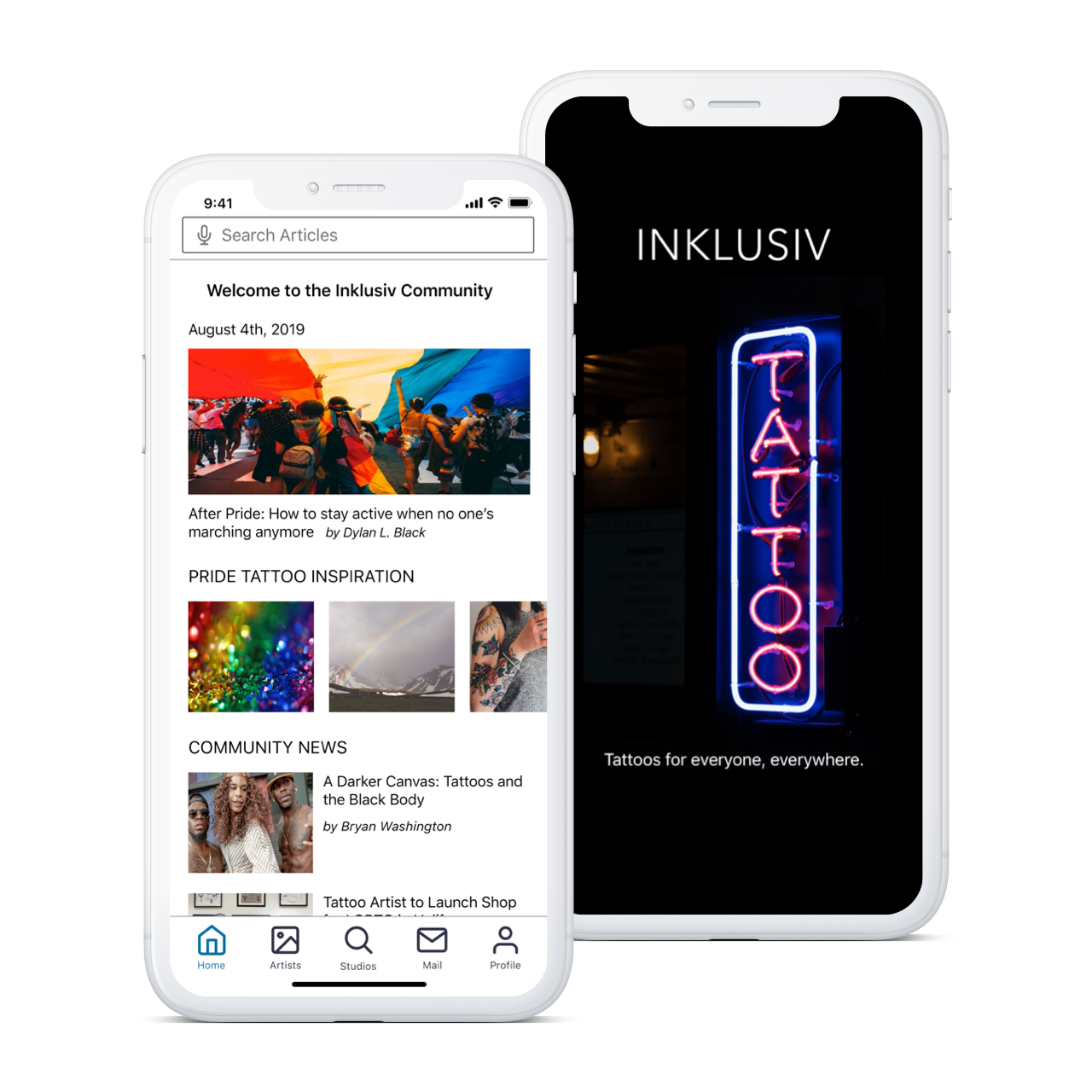
I have created an app that curates a community of seekers, artists, and studios that commit to respect people and prioritize safety. Users can search for Inklusiv shops all over the world, communicate with artists, share their experiences, and connect with other members.
My role
UX Research and Analysis
Product Strategy
Persona and User Journey Creation
UX/UI Design
Wireframes and Prototyping
User Testing
UX Writing and Content Strategy
Ethics and Accessibility Review
User Interviews
I interviewed six tattoo seekers from my user group (women, people of color, and members of the LGBTQ+ community) about their experiences, behaviors, frustrations and goals in getting tattoos.
Findings
Communication with artists is an issue for many people. Feeling unseen or unheard is a problem.
100% of interviewees do not feel safe walking into any tattoo shop, spend considerable time researching, and are still anxious.
A separate, inclusive specific app could help and it’s not possible using the current apps. Right now most of them use internet searches and word of mouth reviews.
Shops that are inclusive and care about people also seem to be better at communication and “seeing” customers.
Everyone, whether seeker or artist, needs to feel welcome, safe, respected.
The majority of the industry is still very white, hetero, cis-male dominated.
“If someone’s homophobic, are they going to take all the precautions with me?”
— User research interviewee
Personas
Based on the interviews I set up three personas to reference throughout the product development process.
Personas were developed from interviews, research, and a global survey.
Personas detail demographics, behaviors and attitudes, needs and goals, frustrations and pain points, and insightful quotes.
These personas were a humbling reminder that I don't fully understand their needs and experiences and therefore should check back with my users frequently throughout the process.
Persona 1, Grey: A queer shop owner whose business provides tattoos in an environment of connection and respect.
Persona 2, Cody: A transgender person who looking for shops where they'll feel safe and respected in different cities when they travel.
Persona 3, Angela: A woman of color who wants to search artists by skill and communicate in advance to mitigate the likelihood she'll encounter misogyny or racism.
“There is discrimination and there is caution.”
— User research interviewee


User Flows
These were created to show how each persona would navigate their User Journey, and used as a framework to create the features of my Minimum Viable Product (MVP).
Persona 2: Cody
User Story
As Cody, I want to go through an onboarding tutorial so that I can better understand the app features and understand how this app is different.
Needs and Considerations
Wants to see if/how this app is actually unique.
Wants to be certain all shops on the site are inclusive.
Prefers to be prompted during signup, but if he chooses to skip the tutorial, an ability to complete it later.
Has used tutorials before and understands what to expect/how to navigate them.
Will know he's successful when he’s completed the tutorial and returned to his profile/dashboard.

User Flow: Complete onboarding and learn about app features
Persona 3: Angela
User Story
As Angela, I want to lower the stress of getting a tattoo with the ability to search artists by skill so that I can find someone capable of tattooing on black skin.
Needs and Considerations
Wants to connect with artists who have the skills she needs.
Wants confirmation when she’s booked an appointment with an artist on the app.
Has spent a lot of time searching in the past and is familiar with online booking.
Wants a function on the site which allows her to search by skill (expert at tattooing dark skin).
Prefers an onboarding tutorial to show her skill criteria, a map function for locations, and a calendar.

User Flow: Search artist by skill and book appointment
Sketches
I began my design process with low-fidelity sketches. It was a brilliant way to iterate quickly and increase creativity.
These sketches were used to brainstorm through different design solutions and decide what the MVP for this app should look like.
I made several versions using different formats – templates, stencils, post-it notes.
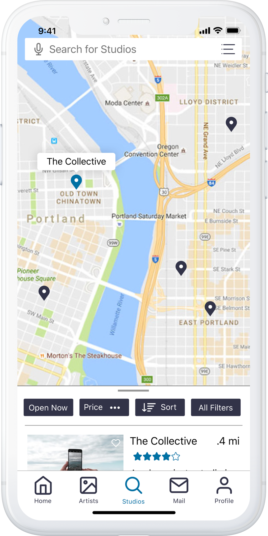
Three features were chosen to focus on: 1) an artist and studio search, 2) a tattoo inspiration board, and 3) a messaging function.
As part of the artist search feature is an ability to search by skill so users can easily find what they're looking for.
The messaging function allows users to vet studios and artists before booking and to collaborate on work.
An art inspiration board allows users to search and favorite tattoo art in the app

“The app itself is a filter for inclusivity.”
— User testing participant
Wireframes
After working through the initial sketches and then a mid-fidelity version in Balsamiq, I created high-fidelity grayscale wireframes for testing purposes.
High-fidelity Wireframes
I used the principles of mobile-first design with a responsive grid structure.
Iterations included strategizing the best placement of the profile and moved from a hamburger menu, to a profile icon in the upper right, to the bottom tab bar.
The bottom tab bar became the main navigation.
I updated the icon style, and revised the tab bar features multiple times, making such changes as moving the favorites section under the user profile.
Search filter iterations began with a single button drop-down, and were refined into a more visible and intuitive framework.
Initially the map was the primary way to view search results, but the ability for the user to choose the view was added via swipe up/down and an icon placed in the upper right of the search bar.
Negative space was considered, with each iteration creating more breathing room between elements while maintaining an accessible font size.


User Testing
Using my high-fidelity grayscale interactive prototype in InVision, I conducted remote and in-person moderated testing with 6 users. Participants worked through scenario tasks in addition to answering questions while using the app.
Findings
There was difficulty navigating with the chosen labels and icons, and users weren't clear what or where "home" was.
Users were unclear what filters were for and why they were there.
Users wanted to see specific artist's portfolios not random pictures of tattoos. One user commented "You don't need the art browse section. Is this a viewing app or a connection app?"
Users wanted a dedicated home page to provide content that supported and celebrated the community.
Most users didn't complete the onboarding scenario task and were unclear how to begin from the introduction screen.
Solutions
Nav bar updated with more streamlined icons and corresponding labels. Home section added back in.
Filter section expanded and made more visible.
Browse art section scrapped entirely. Artist search feature separated out from studio search, and portfolio section became a main component.
To fulfill users' need of connection and community, dedicated "home" section created for news and articles.
Onboarding tutorial placed after signup page, allows skipping straight to home screen.

UI Design
After I updated the wireframes based on user testing, I started designing the final full-color screens in Sketch.
Quick Facts
I created a Style Guide and Design Language which considered visual design principles, strategic emotional design, and accessibility.
UI design was updated several times to meet accessibility guidelines and is on the way to meeting AA standards.
Elements were designed using the iOS Styleguide in addition to WCAG.
SF Pro text was used throughout the app and sized to meet visual accessibility standards.
Contrast between background and text was checked in each scenario to meet the minimum 4.5:1 ratio for AA guidelines.
My design was inspired by elements of Airbnb, Yelp, Instagram, Lyft and Scandinavian design.
Special thank you to Unsplash, Angle, Medialoot, the Noun Project for featherweight icons, and the ever generous Pablo Stanley.


Thanks for making it all the way down here. Click or tap below to check-out my interactive prototype of Inclusive!